|
The Input Panels app contains the list of input panels. An input panel serves as UI also. It contain several input objects such as textbox, combobox, checkbox, lable, etc. You can attach an input panel to a viewer template (windows form) to create powerful data input applications. When an input panel is attached to the viewer template, it is usually named InputPanel1. If you want to acces the value of the input object, you can refer to the InputPanel1 as its container name.
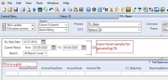
Below is a sample of Input Panel which contains input fields like Lables, DatePicker, Combox which are used in getting query parameters before generating Trial Balances:
The system is shipped with several input panels that your can readily use. Moreover, you can copy and existing template and modify it or simply create a new one.
Step-by-step instructions:
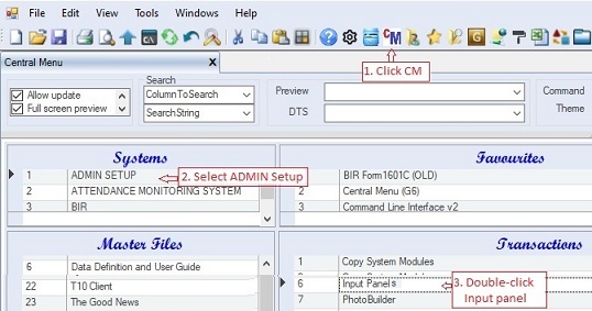
1. Click Cenral Menu. Your Central Menu maybe different from the screenshot below as each user can have different menu and access rights.
2. Select Systems-> ADMIN Setup
3. Double-click Transactions -> Input Panels. You will be redirected to Input Panels tab window.
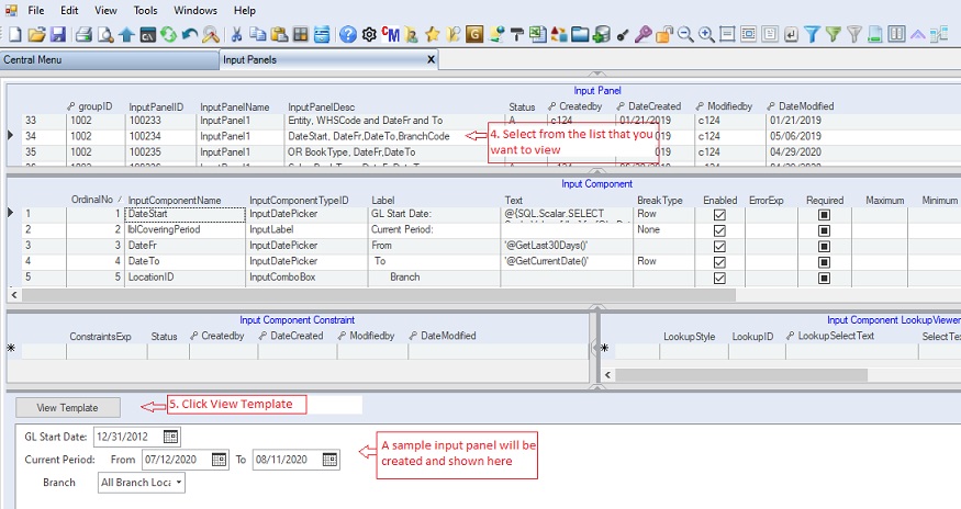
4. To view an existing input panel, select from the list the one that you want to view from the Input Panel table
5. Click View Template button. The template will be shown at the bottom. You can expand the view by adjusting the splitter panels, if necessary.
You can create new Input Panel, if necessary, to serve your requirements. Following are the steps in creating new Input Panel.
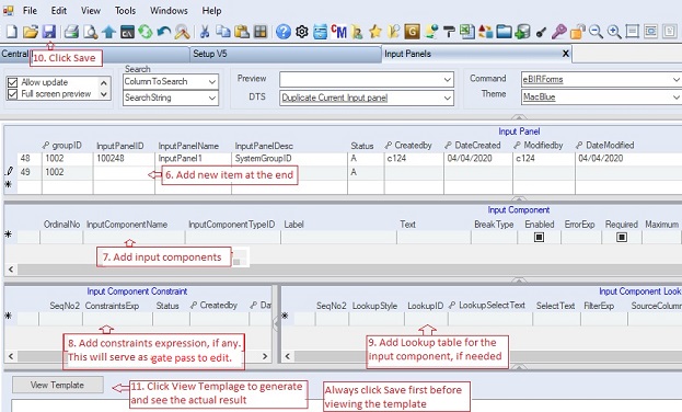
6. Add new item at the end of the header table Input Panel.
Input Panel table contains the panel ID and its description. Below is the Input Panel table data column definition .
oGroupID - the default is 1002, don't change it as it is being used as a child key.
oSeqNo - Obsolete as the system is now using InputPanelID as the primary key. SeqNo is now set to hidden.
oInputPanelID - Alphanumeric field which serves as the primary key. The system automatically fills this up for you anyway.
oInputPanelName - the name of the control object when created. Always use InputPanel1so that when you refer to it using the parser, you can use only one name
oInputPanelDesc - the descriptive note about the panel. It is recommended to list down all the input components of the panel so you can easily identify the components.
oStatus - A=Active; I=Inactive. Accounts marked Inactive will not be show on the lookup table.
7. Add input components on the detailed table Input Component.
Input Component table contains the list of input component objects such as ComboBox, TextBox, DatePicker, Label, etc. to be attached into the input panel. Below is the Input Component table data column definition.
•InputPanelID - part of primary key and it is used as child key of the header Input Panel table above. This is hidden
•SeqNo - numeric field and part of primary key. The system automatically supply the value in chronological order. This is hidden
•OrdinalNo - Integer type which is used as the sort order in creating and adding the input component objects in the Input Panel.
•InputComponentName - the name of the object when added to the input panel. You will need the name as reference to the parser
•ComponentTypeID - the type of the input component. You can choose from the following list:
|
InputGroupHeader
|
Group header in a C1InputPanel control.
|
|
InputCheckBox
|
Represents a check box element in a C1InputPanel control.
|
|
InputComboBox
|
Represents a combo box element in a C1InputPanel control.
|
|
InputDatePicker
|
Represents a date-picker element in a C1InputPanel control. Allows the user to select a date.
|
|
InputImage
|
Image in a C1InputPanel control.
|
|
InputLabel
|
Label in a C1InputPanel control.
|
|
InputNumericBox
|
Represents a numeric box element in a C1InputPanel control.
|
|
InputRadioButton
|
Represents a radio button element in a C1InputPanel control.
|
|
InputTextBox
|
Represents a text box element in a C1InputPanel control.
|
|
InputTimePicker
|
Represents a time picker element in a C1InputPanel control
|
•Label - the label to be shown right before the input component control.
•Text - the default value of the input component control.
•BreakType - the type of break when a succeeding input component control is to be added. Following are the break type enum:
oNone – The layout will not break the flow after the component.
oRow – The default setting. Sets each component to be placed in a new row within the flow.
oColumn – Creates a new column after the component.
oGroup – Creates a new row starting below the current input component, at the left edge of the current group.
•Enable - check to enable the input component.
•ErrorExp - error expression to be evaluated whe the user input data into the input component
•Required - check to require the user to input data into the input component. In short, blank entry is not allowed
•Maximum - the maximum value of the input component control.
•Minimum - the manimum value of the input component control.
•Height - the height of the input component control.
•Width - the width input component control. You can use the width to align the controls position
•PasswordChar - place * if you wish to hide the value.
•DtsCatalogID - the DTS Catalog ID to be executed when the input component is clicked. This serves like an hyperlink.
•ReportCatalogID - the Report Catalog ID to be executed when the input component is clicked. This serves like an hyperlink.
•ClearControlName - the names, separated by comma, of the input component controls to be cleared when the input component is clicked. Ex: Reset will clear all the inputs.
•ToolTip - the tooltip to be shown on the input component.
•Status - A=Active; I=Inactive.
8. Optionally, you may add constraints expression for each input component under Input Component Constraint table. The constrainst expression will be evaluated by the parser when the input component got focus. Thereby, this will serve as a gate pass to allow the user to edit the value of the component. Ex: Require the user to enter first is UserID before he/she will be allowed to enter his/her Password.
9. A lookup table or drowpdown list can be associated to an input component using the Input Component Lookup Viewer detailed-table. Ex: A ComboBox usually contains dropdown list. To attach a lookup table or dropdown list into an input component, you must select first the input component from the table Input Component Control Object..
Below is the Input Component Lookup Viewer table data column definition .
•InputPanelID - part of primary key and it is used as child key of the header Input Panel table above. This is hidden
•SeqNo - numeric field and part of primary key and child key. This is hidden
•SeqNo2 - numeric field and part of primary key. The system automatically supply the value in chronological order. This is hidden
•LookupStyle - the style determines how the lookup will be attached. You can select between Dropdown and Lookup Table from the list.
•LookupID - the reference ID from the Lookup Table Collections. This list contains all the available lookup tables, you can update the list.
•Select Text - optional only when you did not select the LookupID fron the list. The Select Statement will be executed when generating the lookup table. Preferrably, you should add in the Lookup Table Collections your Select Statement so it can be reusable.
•FilterExp - optional only. The filter expression to be evaluated everytime the lookup table is called.
•Source Columns - optional only. The names of the columns from the lookup table to be mapped against the Target Columns. Leave blank, the system will automatically mapped the columns with the same names as the input panel
•Target Columns - optional only. The names of the input components to be mapped against the Source Columns of the lookup table. Leave blank, the system will automatically mapped the input components with the same names as the lookup table
•Retrieve All Recordst - usually marked check so that the lookup table is filled already when called by the user.
•Allow Mutiple Selection - optional only. When checked, the lookup table's mutiple tab will be enable that will allow the user to drag and drop mutiple records.
•Status - A=Active; I=Inactive.
10. When done, click Save.
11. Click View Template button to check if it is done and shown correctly.
Instead starting from scratch, you can copy/duplicate existing template and then modify the newly created template. Following are the steps:
12. Select the input panel template you want to duplicate and then click DTS -> Duplicate Current Input Panel
13. The newly created template similar to the selected existing template will shown at the bottom.
14. Edit the template to suit your needs. Follow instructions #7-#11 above
|