|
|
The Viewer Templates app contains the list of templates which serve as user interface (UI). The system is shipped with several UI templates. You can create more templates or copy and update an existing one. Morever, the system is shipped with several non-editable Embedded Viewer Templates.
Step-by-step instructions:
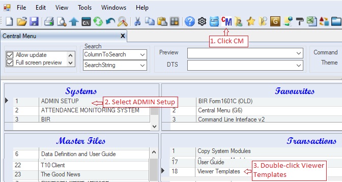
1. Click Cenral Menu. Your Central Menu maybe different from the screenshot below as each user can have different menu and access rights.
2. Select Systems-> ADMIN Setup
3. Double-click Transactions -> Viewer Templates. You will be redirected toViewer Templates tab window.
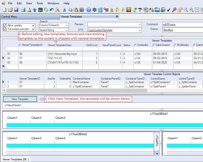
4. To view and existing template, select the template you want to view from the Viewer Templates table
5. Click View Template button. The template will be shown at the bottom. You can expand the view by adjusting the splitter panels, if necessary.
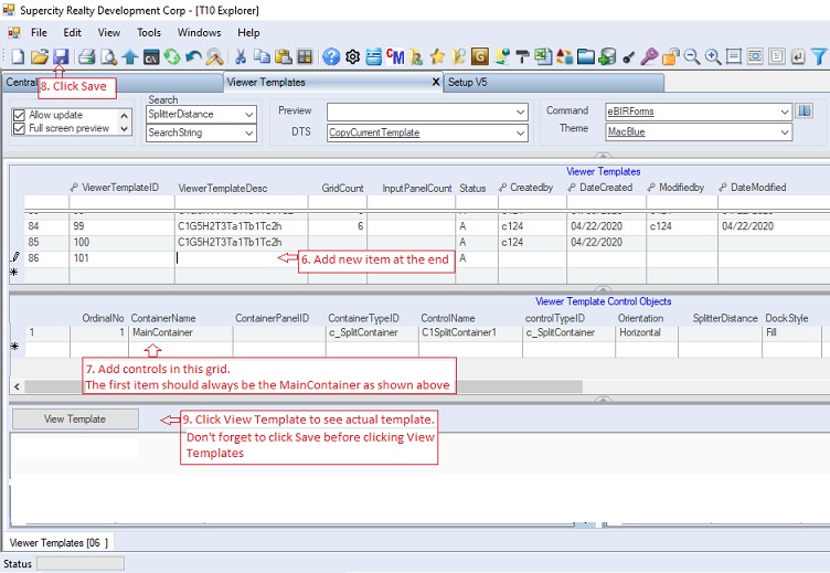
6. To add new template, goto the end of the header table Viewer Templates and add the new template at the end of the grid.
The Viewer Template describes what the template is. Below is the data column definition:
|
Column Name
|
Sample Value
|
Description
|
|
ViewerTempateID
|
|
The system automatically provide the number. Don't edit or delete existing ViewerTemplateIDs as they are being used already by an existing apps. This is the primary key of the table
|
|
ViewerTemplateDesc
|
|
Description of the template. You can use note syntax like: C1=uses componentone, Gx=number of grids, Tx=number of tabs. Ta1=Ta2 has one(a) 2 grids.
|
|
GridCount
|
|
The total number of grid controls of the template, so that other developer may easily choose and filter based on this column
|
|
InputPanelCount
|
|
The total number of input panel controls of the template, so that other developer may easily choose and filter based on this column. Currently the system supports only one input panel.
|
|
Status
|
A
|
Record status:
A=Active
I=Inactive
|
7. Add object controls on the detailed-table Viewer Template Control Objects.
The Viewer Template Control Objects contains all the control objects to be attached into the template such as tabs, grids, textboxes, labels, etc. Below is the data column definition.
|
Column Name
|
Sample Value
|
Description
|
|
OrdinalNo
|
|
Integer type which is used as the sort order in creating and adding the control objects in the template.
|
|
ContainerName
|
|
The name of the container where the control will be added. The first container is always called the MainContainer
|
|
ContainerPanelID
|
|
This is obsolete and you may leave it blank as the preferred way of creating a container panel is the c1Panels which automatically created the needed panels.
|
|
ContainerTypeID
|
|
The type of the container panel. It is recommended to choose from the following 4 latest containers only as described below:
1. SplitContainer - the main container for c_SplitterPanel. This container can have several panels split horizontally or vertically
2. c_SplitterPanel - the panels of the c_SplitContainer. Panels can be split horizontal and vertically. It can also serve as a container
3. c_DockingTab - the main tab container for c_DockingTabPage. This tab container can have several tabs. The required Command Dock is automatically created.
4.) c_DockingTabPage - the tab pages of the c_DockingTab. This serves as a container for other controls such as the grid, input panel, etc.
|
|
ControlName
|
|
The name of the control object when it is attached to the template or container. Use names uniformly so that you can use the templates interchangeably. Ex: DateFr and DateTo are always used for covering period instead of DateStart and DateEnd.
|
|
ControTypeID
|
|
The type of the control to be attached into the template. It is recommended to choose from the following latest control types as described below.
1. c_SplitContainer - the main container for c_SplitterPanel. This container can have several panels split horizontally or vertically
2. c_SplitterPanel - the panels of the c_SplitContainer. Panels can be split horizontal and vertically. It can also serve as a container
3. c_DockingTab - the main tab container for c_DockingTabPage. This tab container can have several tabs. Command Dock is automatically created.
4. c_DockingTabPage - the tab pages of the c_DockingTab. This serves as a container for other controls such as the grid, input panel, etc.
5. c_FlexChart - C1 control for displaying flex chart
6. c_FlexGrid - C1 control for displaying and updating records using grid. This is linked to the Table Collections grid of the Setup module where the resultset of the Select Statement is stored.
7. c_TrueDBGrid - C1 grid control for displaying and editing records. Currently this is the preferred grid control since the c_FlexGrid is not yet fully supported. This will be linked to the Select Statement of the Table Collections under the App Gallery module where the resultsets are displayed.
8. c_InputPanel - C1 control for displaying input component controls such as label, textbox, combobox, etc. This is linked to the Pagination Input Panel modules where the input component controls are displayed.
|
|
Orientation
|
|
Obsolete since c_SplitContainer uses the DocStyle instead. Use to split horizontally or vertically the split panels. Some old viewer templates still use this control and retain to support these old templates
|
|
SplitterDistance
|
|
Obsolete since c_SplitContainer uses the Height instead. Refers to the distance ratio of each panel. Some old viewer templates still use this control and retain to support these old templates
|
|
DocStyle
|
|
The style on how the control will be docked into its container. Following are the available dock style enum:
1. Bottom - The control's bottom edge is docked to the bottom of its containing control.
2. Fill - All the control's edges are docked to the all edges of its containing control and sized appropriately.
3. Left - The control's left edge is docked to the left edge of its containing control. For C1SplitContainer, it will split the panel vertically, the first panel will be placed at the left-most side
4. None - The control is not docked. For C1TabPage, no tab caption will be shown in the control container.
5. Right - The control's right edge is docked to the right edge of its containing control. For C1SplitContainer, it will split the panel vertically, the first panel will be placed at the right-most side
6. Top - The control's top edge is docked to the top of its containing control. For C1SplitContainer, it will split the panel horizontally
|
|
Height
|
|
the height of the control. If it is a container control, it represents as a splitter distance. Ex: 50 will mean half of the container space will be occupied by the control.
|
|
Width
|
|
the width of the control. The default is always filled the entire width of its container. So just leave it blank.
|
|
Tab Alignment<
|
|
the position of the tab in its container. Following are the tab alignment enum:
1) Bottom - The tabs are located across the bottom of the control.
2) Left - The tabs are located along the left edge of the control.
3) Right - The tabs are located along the right edge of the control.
4) Top - The tabs are located across the top of the control.
|
|
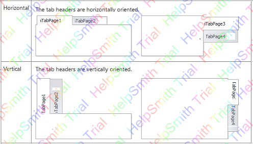
Tab Text Orientation
|
|
the orientation of the tab header. Following are the text orientation enum:
•Horizontal - tab headers are shown horizontally
•VerticalLeft - tab headers are shown vertically to the left
•VerticalRight - tab headers are shown vertically to the right
|
|
Tab String Alignment
|
|
In addition to choosing the tab alignment layout, you can also specify how the tabs are aligned along the side of the page content area by setting the property to Near, Far, or Center.
•Near - the tabs are placed from the left
•Far - the tabs are placed from the right
•Center - the tabs are placed at the center
|
|
Tab Size Mode
|
|
In addition to customizing the height and width of each tab you can also set a mode for the tabs. Following are the available modes:
1. FillToEnd stretches the tabs so they take the whole width of the tab contro
2. Fit squeezes all tabs so they fit into the width of the tab control.
3. Normal member gets the default sizing mode
|
|
Can Move Tab
|
|
If checked the tab can be moved by the user at runtime
|
|
Multiline
|
|
If checked, the tab will be shown on mutiple lines. This is not recomended, it is better to use short tab caption to fit in one line
|
|
Auto-hiding
|
|
Usually unchecked. If checked the tabs are automatically hidden.
|
|
Visual Style
|
|
Obsolete as the sytem is now using There Roller as its visual style.
|
|
Tab Layout
|
|
the orientation of the tab text. This is almost the same as the tab text orientation (see above photo).
|
|
Tab Image
|
|
image to be shown as part of the tab header. Make sure the file is accessible to all users.
|
|
No. of Grids/Panels
|
|
if the control is a container, you can easily attach grids and/or panel into it.
|
|
Grid/Panel Names
|
|
he names of the grids and/or panels. The names should be separated with comma. The names should equal the No. of Grids/Panels above. You should use the following name syntax:
•c1InputPanel1 - for input panel. The system only support one input panel
•c1TrueDBGrid1 - for TrueDBGrid.
•c1FlexGrid1 - for FlexGrid.
oEx: c1TrueDBGrid1, c1TrueDBGrid2, c1TrueDBGrid3 (3 grids will be created inside the container)
|
|
Grid Split Orientation
|
|
The type of split to be used by the container.
1. Bottom - The control's bottom edge is docked to the bottom of its containing control. It will split the panel horizontally where the first grid will be shown at the botoom
2. Fill - All the control's edges are docked to the all edges of its containing control and sized appropriately. This is applicable only for one grid.
3. Left - The control's left edge is docked to the left edge of its containing control. It will split the panel vertically, the first grid will be placed at the left-most side
4. Right - The control's right edge is docked to the right edge of its containing control. It will split the panel vertically, the first grid will be placed at the right-most side
5. Top - The control's top edge is docked to the top of its containing control.It will split the panel horizontally where the first grid will be shown at the top
|
|
Status
|
A
|
Record status:
A=Active
I=Inactive
|
8. When done click Save.
9. Click View Template button to check if it is done and shown correctly.
Instead starting from scratch, you may copy an existing template and modify the newly created one. Following are the steps in copying and modifying an existing templates.
10. Select the template you want to copy and then click DTS -> CopyCurrentTemplate
11. The newly created template similar to the selected existing template will shown at the bottom.
12. Goto the newly created template and modify it to suit your needs. Follow instructions #7-#9 above
|
|