|
The Column Format provides additional formating style for the data grid columns such as Lock, Hide, Required, Caption, Color, Number Format, Cell Style, etc.
In this sample, we will examine the column format applied to Journal Entry v20.
Step-by-step instructions:
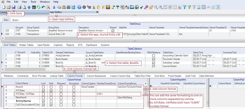
1. Open App Gallery
2. Goto the grid called TableGroup and look for the app named Journal Entry V20.
3. Goto TableCollections and select table BookSL where you want to change the column format of the data grid.
4. Click Column Formatr tab
5. Under the Column Format data grid, add the column format that you want to implement.
6. Click Save.
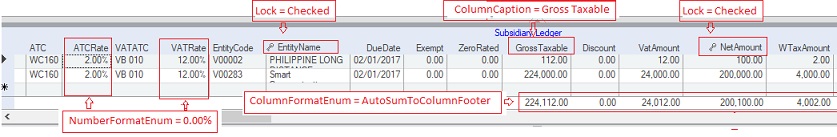
The above format is implemented below:
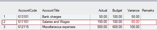
Individual Cell formatting is also supported using FetchCellStyle. See some samples below.
1, Red forecolor when the cell value is negative.
In this sample the cell in the column Variance has red forecolor when the value is negative.
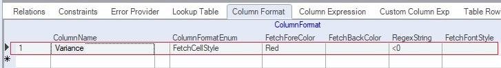
To implement the above formatting, see below column format.
Whenever the cell in the column "Variance" meets the RegexString "<0", the red forecolor will be applied to the cell. Note that the RegexString is <0 has no spacing.
2. Disable specific cell column when the Regex is true.
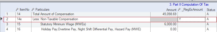
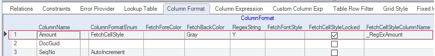
In this sample the Amount column is locked and with a gray backcolor when the value of the _RegExAmount is "Y", see row two in the image below. In the actual app the column _RegExAmount is hidden from view for better presentation.
To implement the above formatting, see image below.
Take note of the FetchCellStyleColumnName = "_RegExAmount" and the RegexString = "Y". This means whenever the the cell of the colunn " _RegExAmount" has a value of "Y", the cell style will be applied which is Gray backcolor and additionally lock the cell because the FetchCellStyleLocked is checked.
Data Definition for Column Format:
|
Column Name
|
Sample Value
|
Description
|
|
ColumnName
|
|
Name of the column where the formatting will be applied. The column name must be present in the corresponding Select Statement. You can enter more than one column separated by comma.
|
|
Lock
|
|
If Checked, the column will be locked from editing and a small key is placed before the column name
|
|
Hide
|
|
If Checked, the column will be hidden from the grid. To unhide the column at run-tume, right-click on the column and the select the name of column to unhide.
|
|
Required
|
|
If Checked, the value is required to be inputted for the column.
|
|
Encrypted
|
|
If Checked, the value will be encrypted when saved to the database.
|
|
ColumnCaption
|
|
Column header to be shown. The default caption is the field name in the Select Statement
|
|
ColumnHeadingAlignment
|
|
Column heading alignment as follows:
1. Left - default for numeric
2. Right - default for string
3. Center
|
|
HorizontalAlignment
|
|
Horizontal alignment as follows:
1. Left - default for numeric
2. Right - default for string
3. Center
|
|
VerticalAlignment
|
|
Vertical alignment as follows:
1. Center
2. Top
3. Bottom - default value
|
|
ColumnFooterText
|
|
Footer text of the column, if any. You can add a total value as footer for numeric fields using ColumnFormatEnum, see ColumnFormatEnum below.
|
|
NumberFormatEnum
|
|
Number format of the column. You can type or select from the dropdown list. For TIN you can type the format 000-000-000 and select Edit Mask under ColumnFormatEnum, see below. You can check the Vendors app as an example.
|
|
ColumnFormatEnum
|
|
Column style format as follows:
1. AutoIncrement - Column will be chronologically filled-up
2. AutoSumToColumnFooter - Sum value of the column as footer
3. ButtonAlways - A button icon will be placed in the column
4. ButtonText - Alsame as ButtonAlways
5. CheckBoxColumnHeader - A check box will be place at the column header
6. ColorDialog - A pop-up color dialog will be placed in the column
7. Edit Mask - Input mask used to edit cells. Ex: 000-000-000 for TIN
8. FetchCellStyle - Customize fonts and colors on a per-cell basis
9. FetchColumnStyle - Customize fonts and colors on a per-column basis
10. FetchControlStyle - Customize fonts and colors on a per-control basis
11. FetchFooterStyle - Customize fonts and colors on a per-footer basis
12. FetchRegexCellStyle - A Regex to be applied on a per control basis
13. FetchRowStyle - Customize fonts and colors on a per-row basis
14. FolderBrowserDialog - A Folder browser dialog pop-up window will be attached.
15. FontDialog - A Font dialog pop-up window will be attached
16. OpenFileDialog - An Open file dialog pop-up window will be attached
17. PasswordChr - Character to hide input. Ex: *
|
|
FetchForeColor
|
|
Forecolor to be applied when a FetchStyle is attached. See ColumnFormatEnum above
|
|
FetchBackColor
|
|
Backcolor to be applied when a FetchStyle is attached. See ColumnFormatEnum above
|
|
RegexString
|
|
Regex to be evaluated when applying FetchStyle
|
|
FetchFontStyle
|
|
Font to be applied when a FetchStyle RegEx is true
|
|
FetchCellStyleLocked
|
|
If Checked, the row or cell will be locked for editing. See example: 1601C data entry where some cells are grayed and locked.
|
|
FetchCellStyleColumnName
|
|
The column where the fetch style regex is stored and evaluated. This is usually used for cells or rows that have different styles. See 1601C
|
|
CellMergeEnum
|
|
Merged style for cells with the same values as follows:
1. None - default value
2. Free - cells with same values will be merged
3. Restricted - adjacent cells with the same values will be merged
|
|
RoundOff
|
|
Round off the value of the column. Select from the dropdown list.
|
|
RemoveSpecialChar
|
|
List of characters you wish to remove when the data is saved. Use EdtiMask
|
|
Height
|
|
Height of the grid rows
|
|
Width
|
|
Width of the grid's columns
|
|
ColumnIndex
|
|
Index position of the column in the grid
|
|
CellTipHeaderText
|
|
Tool tip to be shown on the grid's header caption
|
|
CellTipColumnName
|
|
Tool tip for the grid's column
|
|
MinValue
|
|
Minimum value of the column that can be entered by the user, if any
|
|
MaxValue
|
|
Maximum value of the column that can be entered by the user, if any
|
|
Status
|
|
A=Active; I=InActive
|
|
Createdby, DateCreated, Modifiedby, DateModified
|
|
These columns are called audit trails. Their values are auto-generated. One who created or modified the app. It is assumed that the current user is the one who created or modified the record.
|
|
TableGuid
|
|
Part of primary key and also a child key of the parent table, TableCollection
|
|
SeqNo
|
|
Park of primay key and use also in sorting of records
|
|