|
An application or app is a module in a given system. A system composed of several apps. You can add or modify an existing app; all you need to learn is T-SQL. The T10 scaffolding feature enables to automatically generate code for displaying, updating, creating and deleting data.
In this sample, we will create an app for simple vendor master file. We will name it Vendors Version 3. Before creating this new app, you must create the needed database tables using SQL Server Management Studio or any similar software. In this sample, it is assumed that the table "mf_Vendor" is already present in the database.
Step-by-step instructions:
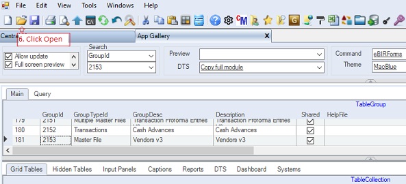
1. Open App Gallery
2. Add new app at the end of the grid called TableGroup as shown below.
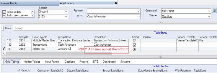
TableGroup - Contains the list of all developed apps. This is the top-level parent table of the module. You can add or modify an existing app.
Fill-up Table Group as follows:
|
Column Name
|
Sample Value
|
Description
|
|
GroupId
|
2153
|
Primary and unique key column of the table. It is recommended to use 4 digit number
|
|
DBLinkKey
|
|
This column is locked and automtically filled-up. You can goto this cell and click Open button to open current app.
|
|
GroupTypeId
|
Master File
|
Choose from the dropdown list:
1. Master File - intended for one table master file menu app.
2. Multiple Master Files - intended for one or more tables master file menu app.
3. Transactions - intended for transactions data entry menu app
4. Reports - intended for generating reports menu app
5. Systems - obsolete. Intended for app not to be altered.
6. Central Menu - intended for Central Menu app
|
|
GroupDesc
|
Vendors V3
|
The name of the app. The value will also be shown in the Menu.
Note: It is better to create a new version than updating an existing one. Later, you can delete the old version when a new version becomes stable.
|
|
Description
|
Vendors V3
|
Descriptive note about the app
|
|
Shared
|
Checked
|
If shared, the user will automatically able to access the module using the default Central Menu
|
|
HelpFile
|
|
Optional only. Related help file, if any. The system is shipped with default help file
|
|
ViewerTemplate
|
|
The name of embedded viewer template. The viewer template serves as the UI. You can leave this blank and select a template using ViewerTemplateID below as there are more UIs to choose from.
|
|
ViewerTemplate
AssemblyName
|
|
The assembly name of the embedded template.
|
|
ViewerTemplateID
|
01
|
Select the Viewer Template to be used from the table lookup. We select 01 as this contains only one grid control to store the vendors records. See Viewer Template on how to add new templates for details.
|
|
ViewerTemplateDesc
|
G1
|
Column is locked. Description of the viewer template based on selected ViewerTemplateID above. In this case G1 means one grid. You need a template with one grid only since there is only one Select Statement to be attached to the UI
|
|
SystemID
|
GL
|
The System where the app is associated. You may link the app to several systems through the Systems tab. Click here for details
|
|
RetrieveAllRecords
|
Checked
|
Always check this so that the system will retrieve the given records. However, if there is a filter or where clause in the Select Statement, it will only retrieve records meeting the filter condition.
|
|
TopMostParent
TableName
|
|
Serves as the table where the filter clause will be used in the WhereClause builder. This is also used as the main table by the Document Numbering when mode is continues
|
|
DocModeExp
|
|
Obsolete as the table collection has its own DocModeExp column now.
|
|
DocDefinedLengthExp
|
|
Obsolete as the table collection has its own DocDefinedLengthExp column now
|
|
GroupWhereClause
|
|
Optional only. Where Clause statement to be applied by replacing the variable @GroupWhereClause in the Select Statement, if any.
|
|
PaginationSchema
|
|
Obsolete. Default Pagination Schema
|
|
PaginationInputPanelGuid
|
|
The Pagination Input Panel to be used, if any, before executing Select Statements. This is usually used as a filter condition in the Select Statement
|
|
PaginationInstruction
|
|
Descriptive instructions to be shown to the user, if any
|
|
LookupSelectText
|
|
Optional only. Lookup table to serve as filter clause for the TopMostTableName. This is only needed if you choose to unchecked RetrieveAllRecords as mentioned above
|
|
LookupPrimaryKeys
|
|
Optional only. Primary keys for the lookup
|
|
LookupRetrieveAllRecords
|
|
Optional only. If checked all records in the LookupSeletecTExt will be retrieved.
|
|
LimitedTransactionEntry
|
|
Obsolete.
|
|
Password
|
|
Enter password to disable editing of the current app module
|
|
ConfirmPassword
|
|
Enter password to enable editing the current app module
|
|
ShareToDeveloper
|
Checked
|
Check to give intention to share your app to other developers
|
|
Status
|
|
A=Active; I=InActive; L=Locked which will avoid inadvertent changes.
|
|
SeqNo
|
|
Hidden column. Use only for sorting the Select Statement of the TableCollection grid.
|
|
GroupIDLink
|
|
Obsolete.
|
|
Createdby, DateCreated, Modifiedby, DateModified
|
|
These columns are called audit trails. Their values are auto-generated. One who created or modified the app. It is assumed that the current user is the one who created or modified the record.
|
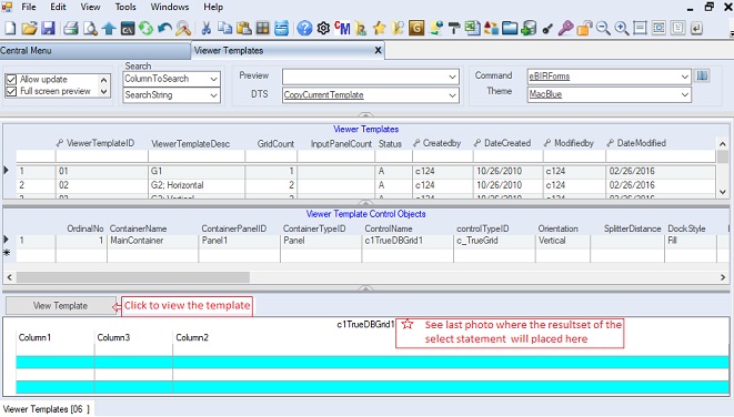
If you want to view the ViewerTemplateID=01, you can goto Systems -> ADMIN Setup then Transactions -> Viewer Templates. See Viewer Templates for details.
Below is the ViewerTemplateID = 01 that contains only one grid. The grid control sample contains empty columns as shown below. The empty columns will be replaced by the resultset of Select Statement. Columns will be adjusted accordingly to accommodate the resultset.
3. Goto Grid Tables tab
4. Fill-up TableCollection grid. The Select Statements must be equaled to the number of grids in the Viewer Template. In this sample the ViewerTemplateID=01 has one grid; therefore, only one select statement is added in the TableCollection.
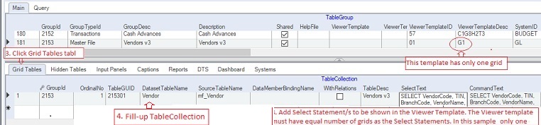
TableCollection - Contains the list of Select Statements to be shown to the user through the Viewer Template. Each resultset of the Select Statement will be linked to grid controls where the user can intereact with the data.
The Viewer Template selected in the TableGroup must contain enough grid controls to accommodate all the Select Statements in this table. In this sample, the template has only one grid because there is only one Select Statement.
Fill-up TableCollection as follows:
|
Column Name
|
Sample Value
|
Description
|
|
GroupId
|
2153
|
Auto-filled. Value is the same as TableGroup because this is a child key.
|
|
OrdinalNo
|
1
|
The order number in which the grid tables are created and linked to the viewer template
|
|
TableGuid
|
215301
|
Follow this syntax: GroupID+0#: Ex: 215301.
Serves as the primary key of the this table.
|
|
DBLinkKey
|
T215301
|
This column is locked and automatically filled-up. You can goto this cell and click Open button to open current app.
|
|
DatasetTableName
|
Vendor
|
The name of the table in the generated dataset
|
|
SourceTableName
|
mf_Vendor
|
The actual table name in the database
|
|
DataMemberBindingName
|
|
The complete bindining name of the table in a master-detail view. Leave blank when there is no binding relation
|
|
WithRelations
|
Unchecked
|
Check if a master-detail relationship exists
|
|
TableDesc
|
Vendor v3
|
This serves as the table caption of the grid.
|
|
SelectText
|
(SQL Select)
|
An SQL Select statement to retrieve the data from the database. The data are shown in the grid
|
|
CommandText
|
(ADO.Net Command Text )
|
The command text in saving the changes to the database. The length of the columns are set using this statement. See ADO.Net for details
|
|
SourceColumns
|
(optional)
|
The actual database column names to be mapped to DatasetColumns
|
|
DatasetColumns
|
(optional)
|
The dataset column names to be mapped to SourceColumns
|
|
PrimaryKey
|
VendorCode
|
The primary key in saving the data. This will also be the field in renumbering the datatable, if needed.
|
|
AdditionalKey
|
|
Additional primary keys. The field name, if mone that one, must be separated by comma
|
|
DateGLColumn
|
|
The field name to use when document numbering mode is set to Yearly or Monthly. The cell value in this column will serve as the year of the document number. Ex: 201900001
|
|
DocModeId
|
Continues
|
The document numbering mode to be used. Follwing are the dropdown list:
1. Manual - number is manullay encoded
2. Continues - number is continues
3. Yearly - number is continues yearly
4. Monthly - number is continues monthly
5. Variable - the mode is dependent on a variable
|
|
DocModeID2
|
|
An expression for dynamic number of the document. This is similar to Variable numbering mode
|
|
DocDefinedLength
|
5
|
The length of the document number padded with 0. Ex: 00001
|
|
AcceptChangesAtOnce
|
|
Check only if you are not going to save any changes made in the grid. This is usually Checked in reports where data are retrieved but need not to be saved
|
|
AllowEditingPrimaryKey
|
|
Check if you allow user to edit primary key.
|
|
AllowAddNew
|
Check
|
Check if you allow user to add new record in the grid
|
|
AllowUpdate
|
Check
|
Check if you allow user to edit records in the grid
|
|
AllowDelete
|
|
Check if you allow user to delete records in the grid. For master file, this is usually uncheck to avoid orphant records
|
|
AllowOldRowDelete
|
|
Check if you allow user to delete previously saved records
|
|
AllowSorting
|
Check
|
Check to allow user to sort data by clicking the column header
|
|
AllowFiltering
|
|Check
|
Check to allow user to filter data using filter bar
|
|
AllowImporting
|
Check
|
Check to allow user to import data into the grid using the Import/Export Tool
|
|
AllowExporting
|
Check
|
Check to allow user to export data into the grid using the Import/Export Tool
|
|
AllowDrag
|
|
Check to allow user to dragging of data to other grid
|
|
AllowDrop
|
|
Check to allow user to dropping of data into other grid
|
|
DeleteAfterDragAndDrop
|
|
Check to delete the dragged record after dropping. This works like row cut/paste
|
|
DragAndDropControlName
|
|
Name/s of the grid participating in the drag and drop
|
|
ShowColumnFooter
|
|
Show grid column footer
|
|
ShowEmptyRows
|
|
Show grid empty row
|
|
ShowFilterBar
|
Check
|
Show grid filter bar
|
|
ShowRecordSelector
|
Check
|
Show grid record selector
|
|
ShowRowNo
|
Check
|
Show the row number on the left side, like in Excel
|
|
AlternatingRows
|
Check
|
Show grid alternating row style
|
|
DirectionAfterEnterEnum
|
|
Movement direction after the user press ENTER key as follows:
1. MoveDown
2. MoveLeft
3. None
4. MoveRight - default value
5. MoveUp
|
|
MarqueeStyleEnum
|
|
Cell marque style as follows:
1. DottedCellBorder - default value
2. DottedRowBorder
3. FloatingEditor
4. HighlightCell
5. HighlightRow
6. HighlightRowRaiseCell
7. NoMarquee
8. SolidCellBorder
|
|
FixedRowCount
|
|
Fixed row for flexgrid only
|
|
FreezeColumnPosition
|
|
Column to be frozen from the left. At run-time the user can still freeze a column
|
|
Zoom
|
|
Default Zoom In/Out of the grid. At run-time the user can still zoom in/out the grid.
|
|
FontCaptionStyle
|
|
Font to be used by the grid
|
|
FontHeaderStyle
|
|
Font style for the header of the grid
|
|
FontDetailStyle
|
|
Font style for the details of the grid
|
|
FontFooterStyle
|
|
Font style for the footer of the grid
|
|
CaptionHeight
|
|
Height of the grid caption
|
|
ColumnCaptionHeight
|
|
Height of the grid column header
|
|
ColumnCaption
VertAlignment
|
|
Vertical alignment of the column header
|
|
RowHeight
|
|
Row height of the grid
|
|
FooterHeight
|
|
Height of the grid's footer
|
|
ForeColor
|
|
Forecolor of the grid
|
|
BackColor
|
|
Backcolor of the grid
|
|
CaptionForeColor
|
|
Forecolor for the grid's caption
|
|
CaptionBackColor
|
|
Backcolor for the grid's caption
|
|
HeaderForeColor
|
|
Forecolor for the grid's header
|
|
HeaderBackColor
|
|
Backcolor for the grid's header
|
|
DetailForeColor
|
|
Forecolor for the grid's details
|
|
DetailBackColor
|
|
Backcolor for the grid's details
|
|
EvenRowForeColor
|
|
Forecolor for the grid's even row
|
|
EvenRowBackColor
|
|
Backcolor for the grid's even row
|
|
OddRowForeColor
|
|
Forecolor for the grid's odd row
|
|
OddRowBackColor
|
|
Backcolor for the grid's odd row
|
|
FooterForeColor
|
|
Forecolor for the grid's footer
|
|
FooterBackColor
|
|
Backcolor for the grid's footer
|
|
VerticalAllignment
|
|
Grid's vertical alignment as follows:
1. Top - default value
2. Center
3. Bottom
|
|
DataView
|
|
Data view of the grid as follows:
1. Normal - default value
2. Form
3. GroupBy
4. Inverted
5. Hierachical
6. MutipleLines
|
|
AutoIncrement
ColumnName
|
|
Obsolete. Use the Column Format table. The system will automatically fill-up the column in sequence.
|
|
AutoDecrement
ColumnName
|
|
Obsolete. Use the Column Format table instead The system will automatically fill-up the column in sequence using negative value
|
|
AutoNumbered
ColumnName
|
|
Obsolete. Use the Column Format instead. This is similar to Auto Increment above but using different method in getting the next number
|
|
Status
|
A
|
Record status:
A=Active
I=Inactive
|
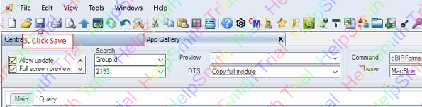
5. Click Save or CTRL+S
To check or execute your new app, you can immediately do so by clicking the Open button
6. Click Open button, the currently selected app, Vendors v3, will be open on a new tab see #11 below.
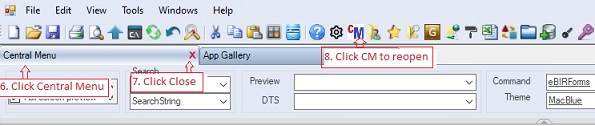
You can also check if the new app is available in the Central Menu, just close and re-open the Central Menu as follows:
(Note: If the new app is not Shared, you must first update User's Rights to gain access into the new app before doing the instructions below)
6. Click Central Menu tab to close it.
7. Click "x" to close it
8. Click CM to reopen it. You need to close/open the CM so that the newly created app will be shown.
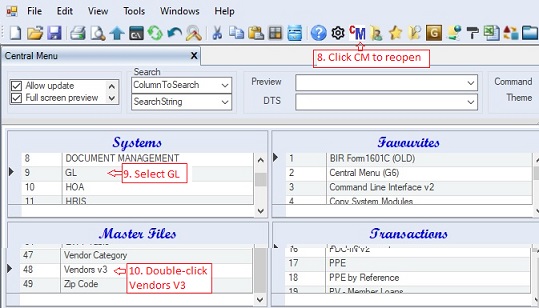
9. Select Systems -> GL. The Vendors v3 app is linked to GL (See value of SystemID under TableGroup above)
10. Double-click Vendors v3. The Vendor v3, is taken from the value of the column TableDesc of TableCollection because the GroupTypeID is set to Master File. Otherwise, the value of the column GroupDesc of TableGroup table will be used, in this sample, they have the same value anyway.
11. The Vendor v3 app will be shown under a new tab with caption Vendors v3. The ViewerTemplateID=01 will be created to serve as UI. The template's grid control will hold the resultset of the Select Statement as shown below:
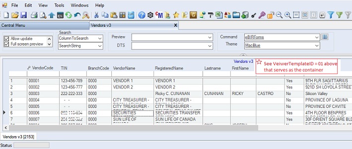
For advance formating of columns, you can check Column Format for details.
|